Assignment #9
Magazine Spread
 |
| Layout by Adjiah Daley |
Objective: In this assignment you will carefully examine how a print magazine (that you choose) is laid out and how the pages hold style continuity within a particular grid pattern (as explained in class). You will then replicate one double-page spread (2 facing pages) from a feature article as a full-size mock-up in InDesign, using the same grid-system. You are copying the layout but introducing your own subject matter, art or photos (which may be borrowed from the Internet), and display text choices to give it your own "signature."
Preliminary: To begin this project start by watching the video on Magazine design found at http://www.youtube.com/watch?v=1Cu5FuAdOVY&feature=related
. Next, bring to class a magazine of your choice to work with, along with a ruler, pencil, a few pieces of tracing paper, and your sketchbook.
Step 1. Create an Accurate Style Sheet. Examine your chosen magazine for its page-to-page, article-to-article continuity. Find the imaginary rule lines (psychic wire) used by the art director to create the design grid. Note the consistencies (and the small variations that seem to be within an acceptable range). Take notes as you study the publication or write directly on the pages of your magazine. You will be turning in the complete magazine plus your notes and/or sketches with your final InDesign document.
Examine the magazine for recurring fonts and other repeating stylistic choices. The Style Sheet provided below is intended to guide you through the process of measuring and notating such details as page size, folio location, column widths, typographic and stylistic continuity, use of horizontal anchor-lines (weight lines), etc.--all things that make up a publication's unique "look." Write down your observations as you go, take notes, sketch your ideas, and attempt to understand the "science" behind your chosen publication's continuity and layout. On the final project you will be evaluated on your attention to detail for things such as point size and style of body text and accurate measurements throughout (alley widths, common headline sizes, and consistent artistic styles--such as BW vs. color photo vs. illustration, etc.).
Step 2. Draw or template a Skeleton Frame of the existing article. Once the style sheet is completed, find an example of a typical feature article in your magazine with a 2-page opening spread. (Note that recurring departmental or column articles are a different animal from the feature article and are inappropriate for this assignment! Choose wisely.)
Produce a preliminary "skeleton" replicating the grid of your chosen article. 1) You can precisely chart the grid used in the article by tracing with pencil on parchment, vellum, or tracing paper; 2) sketch it out in thumbnail in your sketchbook with measurement notes on the side. Or, 3) set up a preliminary template in InDesign with margins and column size estimated as "rough" guideline s but without any text or art included--just the geometric shapes.Whatever route you take to produce your skeleton frame, you should write the measurements you need to adhere to (margins, column width, alleys, etc.) directly on the skeleton to use as a reference when you set up your final InDesign document in Step 3.
Step 3. Set up a facing-page document for your spread in InDesign using the measurements you identified above. Set column widths, margins, anchor guidelines etc. as they will appear in InDesign while adhering PRECISELY to your publication's measurements.
Step 4. Plan/Think Gather your art, choose your display fonts, and get ready to follow the layout as you interpret it. Your layout needs to include effective typography with important elements like pull quotes, teasers, subheads, captions, and anything else that might appear on a “real” page of the magazine, so get these written. Select any photos you wish to use at an appropriate resolution (240 to 300dpi for print). This is also a good time to search out interesting fonts to use as your display text and sketch some details in thumbnail. Use negative space efficiently and don’t clutter your layout. ALWAYS pay attention to readability, focal points, eye path, and other effective magazine design rules.
Step 5. Create the final InDesign Document. Your final layout should look like a published article (pictures/text/and all). Use any text as a placemarker for body copy in your mock-up. You can use the Placeholder Text command found in the InDesign Menu fby choosing Type>Fill with Placeholder Text (this is the gobbledygook designers use called “greeking”).
Step 6. Export the finished article as a print-ready document in PDF format. Include printers’ bleeds and crop marks when you export the final document to pdf for print. This final InDesign file is the finished mock-up (it does not have to be prepared for lithographic printing with color separations but should look as professional as any page in the magazine.)
Evaluation Criteria: The finished assignment will show an understanding of page continuity, magazine design traditions, effective typography, and readability, accurate translation of an existing design grid, and effective use of repetition and rhythm. You will be evaluated on how well your article looks like it came out of the same publication as the one you are "duplicating"--but also for your creative ability to put your own unique signature on it, with attention to focal interest, and evidence of effective planning with accurately measured detail.
Email the final PDF doc to me, and load the InDesign file (fully packaged with fonts and photos) onto Server 8. In addition, turn in all evidence of “pre-production” to me or your grade will suffer severely. (Obviously, in order to create a professional-looking spread you must first have determined the “rules” of layout for the magazine you’ve chosen and followed the directions above.) The final project should look like a published article (pictures/text/and all) and needs to include these components...
LISTS OF ASSIGNMENT COMPONENTS:
- the final mock-up exported to pdf, printer-ready with all printer mark/emailed to me
- the ID file loaded in your folder in the Student Drop Box
- any lists, notes,and thumbnails you've made to plan and design your spread
- the completed style sheet (provided at the link above) or THOROUGH notes on a page of the magazine itself
- a blank InDesign template or a parchment tracing (or copy) of the original article with accurate measurements written in the margins
- a copy of the original magazine (complete) with the pages you were imitating clearly marked
- a brief note in your final email providing any details about the publication you feel are pertinent to your evaluation

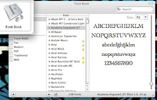
USEFUL TIP: To identify typefaces, your Mac contains a simple tool for viewing all the fonts on your PC--entire alphabet and numbers--in a utility called Font Book.
____________________________________________________________________________
Final Project (Assignment #10)
Self Promotion
10 points
 |
| Brochure (interior) by Jordan Caruso |
There are two components to this final assignment.
Part I-The Written Component: Must be completed first (Due Nov. 22). The first step is to write a self-critique of the skills and knowledge you believe you’ve accomplished in Art 109. Write the piece in a way that would sell your accumulative design skills (how this class builds on other design experiences from previous classes, etc.) not just to me but to a potential employer. Include work experience if appropriate, your "resume" skills, and effective headlines and subheadings throughout. This can be informally written in terms of voice but should be edited for grammar and spelling. The final text should convince me you are a professional who pays attention to detail.
Your critique should be at least (but no more than five) paragraphs, must be double-spaced and might include appropriate bulleted lists of skills or training. This draft needs to be presented to me as a Word doc via email before laying out your InDesign document. On the copy due date I would also like to see sketches for your design piece (described below).
Part II-Design a Self-Promo: The second step is to adapt the text you've written as a self-promotion (edit it!!) and import it into InDesign to create a creative "visual resume" promoting your design and/or technical skills--in a layout that you design with effective graphic elements to include the best artwork you’ve completed for this course (and others if you wish) as well as appropriate headlines/captions/call-outs/quotes/etc. to make the piece inviting. The final product will be a self-promotion, for which a potential client or employer is your audience. Choose an appropriate print format to work in--the choice is yours--(newsletter, brochure, catalog of art, creative 2-page resume, magazine or booklet, poster, etc.). The final piece should be created in InDesign but you may use any CS5 software to finesse the art. Consider changing color cast, going black and white, or simplifying the artwork files to make it all work together cohesively.
Your final email to me with the art should provide the document in pdf form--indicate in your message anything you think I need to know for understanding your intent.
Use your imagination here. A great deal of your grade depends on creativity as well as the sophistication and professionalism of the design.
SOME RESOURCES:


No comments:
Post a Comment