If you can, start today on Assignment 8, the Magazine spread. When we return from Thanksgiving Break there will be only 3 class sessions remaining and you have the final two assignments yet to complete.
Because I am spending less time with you working on Assignment 8, I want to simplify it, and will not be requiring you to fill out the Style Sheet as previously explained. You can jump right into choosing and duplicating a double-page spread (facing left/right pages) from a PRINT magazine of your choice. (DO NOT CHOOSE AN INTERNET PUBLICATION. It must be a printed publication.)
Assignment #8
Magazine Spread
(10 points)
Before you begin this assignment it is important that you have read the assigned readings in the online Adobe Manual: grids and guide lines and creating pages and spreads. You should also review these appropriate Powerpoints and resources:
 |
| Layout by Adjiah Daley |
Objective: In this assignment you will carefully examine how a double-page opening feature article (called a spread meaning 2 facing pages) is laid out for a (in a print magazine that you choose) and replicate it as a full-size mock-up in InDesign. You are copying the grid pattern and layout as well as basic decorative and typography elements but introducing your own subject matter, art and/or photos (which may be borrowed from the Internet) to give it your own "signature."
Preliminary: Bring to class a magazine of your choice to work with, along with a ruler, pencil, a few pieces of tracing paper, and your sketchbook.
Step 1. Measure and make notes of all sizes of the margins, columns, and decorate elements of your chosen layout. Take notes and make a visual guide as you study the article, writing notes and column/gutter measurements directly on the pages of your magazine or a piece of tracing paper (or your sketchbook). You will be turning in the original magazine spread plus your notes and/or sketches with your final InDesign document. (Note, if you turn in this assignment AFTER the last day of class, you MUST scan your notes and visual guides and send them along in the email!)
After examining the magazine and identifying fonts and other repeating stylistic choices, such as folios (text that repeats with a magazine page number) begin to duplicate the spread in InDesign. You may find it helpful to refer to the Style Sheet provided below. The Style Sheet is intended to guide you through the process of notating details such as page size, folio location, column widths, typographic and stylistic continuity, use of horizontal anchor-lines (weight lines), etc.--all things that make up a layout's unique grid system and "look."
It helps to write down your observations as you go, take notes, sketch your ideas, and attempt to understand the "science" behind your chosen pages' continuity and layout. On the final project you will be evaluated on your attention to detail for things such as point size and style of body text and accurate measurements throughout (alley widths, common headline sizes, and consistent artistic styles--such as BW vs. color photo vs. illustration, etc.).
It helps to write down your observations as you go, take notes, sketch your ideas, and attempt to understand the "science" behind your chosen pages' continuity and layout. On the final project you will be evaluated on your attention to detail for things such as point size and style of body text and accurate measurements throughout (alley widths, common headline sizes, and consistent artistic styles--such as BW vs. color photo vs. illustration, etc.).
Step 2. Create a facing-page template for your feature article in InDesign. Set column widths, margins, anchor guidelines etc. as they will appear in InDesign while adhering PRECISELY to your publication's measurements.
Step 3. Plan/Think & Gather your art, choose your display fonts, and get ready to follow the layout as you interpret it. Your layout needs to include effective typography with important elements like pull quotes, teasers, subheads, captions, and anything else that might appear on a “real” page of the magazine, so get these written. Select any photos you wish to use at an appropriate resolution (240 to 300dpi for print). This is also a good time to search out interesting fonts to use as your display text and sketch some details in thumbnail. Use negative space efficiently and don’t clutter your layout. ALWAYS pay attention to readability, focal points, eye path, and other effective magazine design rules.
Step 4. Create the final mock-up InDesign Document. Your final layout should look like a published article (pictures/text/and all) and does not need to be camera ready or include printers marks. You may use any old text as a placemarker for body copy in your mock-up. You can also use the Placeholder Text command found in the InDesign Menu by choosing Type>Fill with Placeholder Text (this is the gobbledygook designers use called “greeking”).
Step 5. Export the finished article as to PDF format and email it to me. First, package (see the ID "file" menu commands) your fonts and images into a folder you keep for yourself. This final InDesign file is the finished mock-up and should look as professional as any page in the magazine would be when printed.)
Evaluation Criteria: The finished assignment will show an understanding of page continuity, magazine design traditions, effective typography, and readability, accurate translation of an existing design grid, and effective use of repetition and rhythm. You will be evaluated on how well your article looks like it came out of the same publication as the one you are "duplicating"--but also for your creative ability to put your own unique signature on it, with attention to focal interest, and evidence of effective planning with accurately measured detail.
Email the final PDF doc to me. In addition, turn in all evidence of “pre-production” to me. (Obviously, in order to create a professional-looking spread you must first have determined the “rules” of layout for the magazine you’ve chosen and followed the directions above.) The final project should look like a published article (pictures/text/and all) and needs to include:
- the final mock-up exported to pdf/emailed to me (printers marks not required)
- any lists, notes,and thumbnails you've made
- a copy of the original magazine layout (the pages you were imitating) with your measurements and notes (or, a visual sketch/parchment tracing of the original article with accurate measurements written in the margins
- a brief note in your final email providing any details about the publication you feel are pertinent to your evaluation
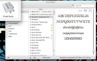
USEFUL TIP: To identify typefaces, your Mac contains a simple tool for viewing all the fonts on your PC--entire alphabet and numbers--in a utility called Font Book/or, check it out. Also handy is a tool called "What the Font?" at MyFonts.com (http://www.myfonts.com/WhatTheFont/)--take a picture of a font with your cell phone, upload the image to What The Font and it will identify the typeface for you.)

Other Resources for Asmt. 8:
Working with justified type:
Create Your Grid & Guides
Working w/Text & Images
Creating a Sample Spread
The Future(?) of Magazine Design
Create Your Grid & Guides
Working w/Text & Images
Creating a Sample Spread
The Future(?) of Magazine Design
No comments:
Post a Comment